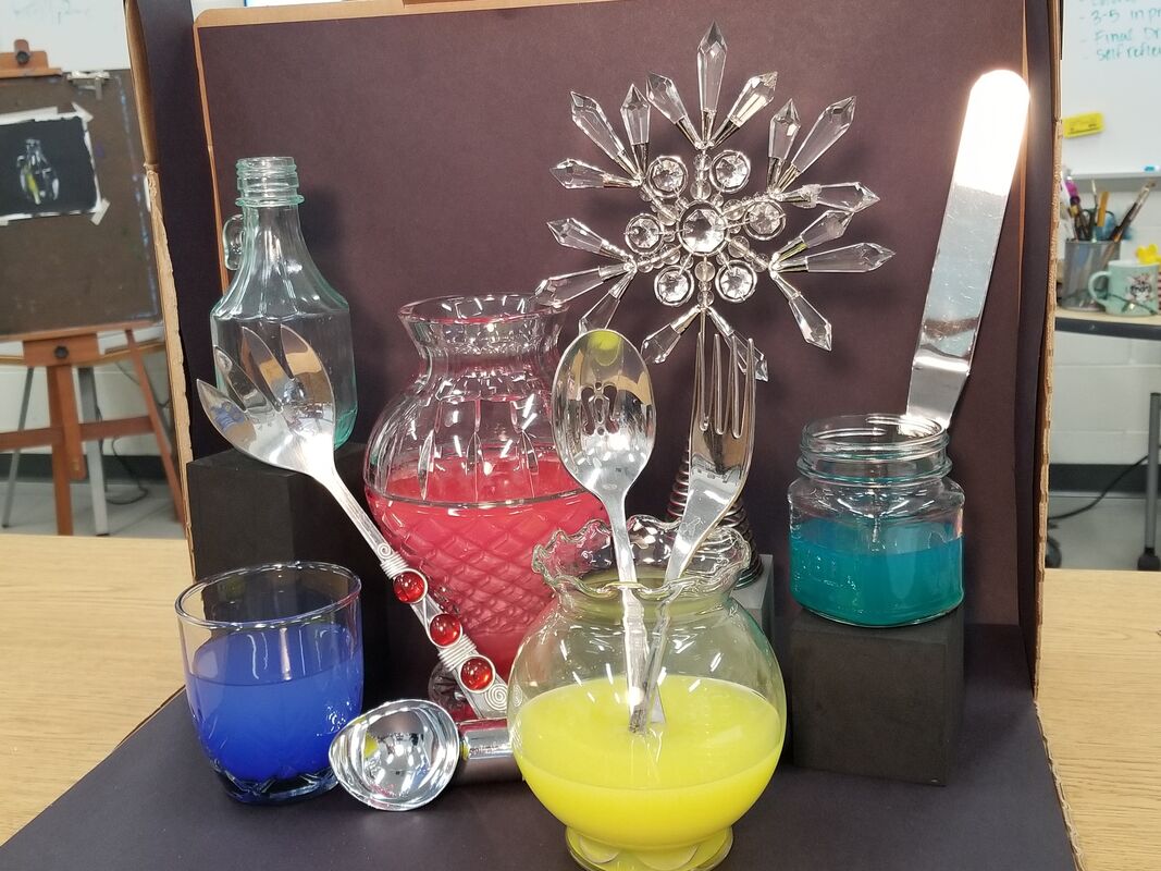
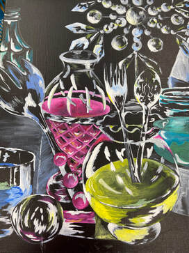
1. I will just go out and say that this piece wasn't one of my best. The craftsman ship looks rushed and in my opinion nothing like the original. I feel it turned out this way because In the beginning I was dedicated and slowly I lost interest and it showed as my work progressed. The biggest flaw was the coloring and how off the final and original was.
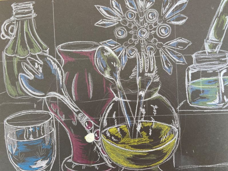
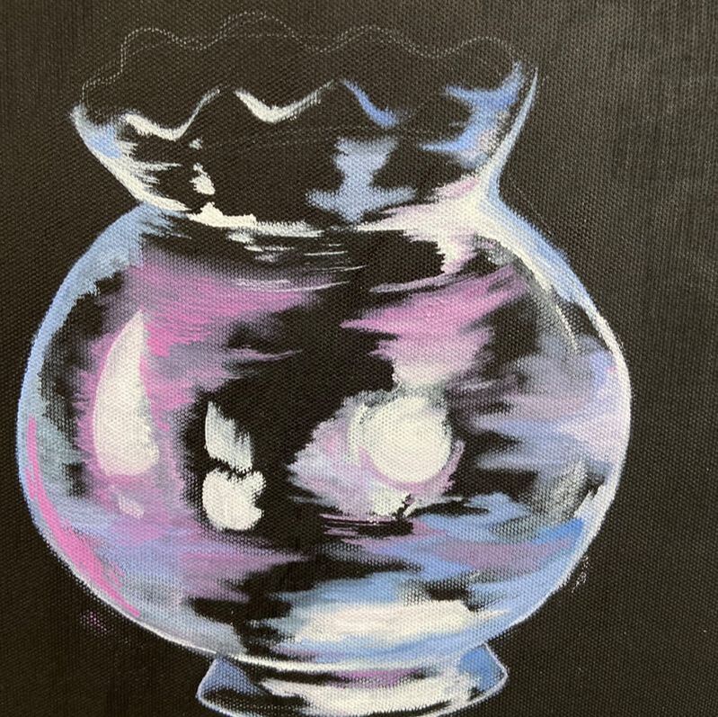
2. There were various forms in contrasts as far as sizing goes but because I made the pieces so close together to fit the canvas it was hard to show this. 3. The style within this painting was supposed to be reflective with a realistic feel to it though I feel that I made it too cartoon like. It was hard to find colors that made it eye catching yet kept a reflective look to it. 4. The only textures in this piece were smooth surfaces so there were no jagged edges or soft surfaces to convey. Though there were dips in some of the glass pieces and it was very vital to make the glass look reflective. 5. Looking back I notice specifically in the yellow bowl I forgot to make the other half of the pink colored vase. Along with that If I could change anything It would go beyond the painting and be the time. I feel as if, with more time This painting could have came out much better.
0 Comments
Leave a Reply. |
AuthorMy name is Phylicia and I go by the same thing. I'm pretty much an open book and my art work hopefully shows that as well. Archives
January 2020
Categories |
 RSS Feed
