 This semester in paint I've learned a lot from each project. 1. In the water color painting I learned the values or layering and the point of less being more. for my piece I made a recreation of a vacation photo of my aunt facing the water at the beach. With water color the more water you add the lighter the color and the less is darker. I struggled to find a balance between light and dark to create my waves. Though I am satisfied with the outcome. 2. The Hundertwasser painting was most likely my favorite. In this piece I used acrylic paint to turn an existing photo into something else. For this piece I chose a clearance that consisted of trees and a lake as my starting. With this project I felt my biggest difficulty was using my creativity to find a way to transform the photo while still making it recognizable. 3. The landscape project taught me the point of a pallet knife and how important texture was. For this piece I used a photo of a highway In New York during the fall. I changed up some of the original colors to make the textures stand out. Though I felt that because I used the pallet knife with the oil paint I was able to create the texture without color change. By this I mean that the pallet knife alone was able to create enough texture without me having to manipulate the color. It wasn't my favorite piece but I did learn much from it. 4. Lastly was the pet portrait where I used oil paint, layering, and color gradient to help create my piece. For this project I made a recreation of my dog that I call puppy. I started with the darker colors and worked my way up with the lighter ones on top. It was difficult because oil paint takes a while to dry and I'd often need the bottom layer of paint to be dry before I could add another layer. This is so they wouldn't mix. Though overall I felt that this was my favorite and more fun project to make. All and all I've learned the importance of gradient, color, texture, layering, strokes, tools other than a paintbrush and most importantly the difference between paints.
0 Comments
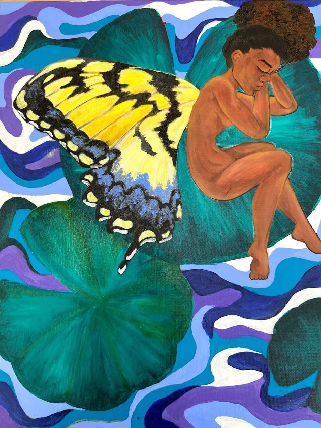
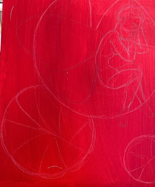
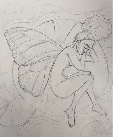 1. The craftsman ship of this piece can be described as rushed. I used both acrylic for the background and oil for the fairy. I had a great time making this but it was also a great challenge trying to complete this in a week and a half. I wish I had taken more time into making my lines in the water more straight though at the same time I like the slightly messy look of it. 2. In this painting I wanted to incorporate the technique from every project I had so far into this piece. I had the water idea incorporated from my Hundertwasser piece, the hair texture using the pallet knife like in my landscape. I used the layering of colors for the skin of my fairy like my pet portrait and the color contrast of the lily pads like my water color painting. 3. One this that I loved about this would be the outcome of my skin . It was a first for me and I feel like for my first time I did fairly well. Next time I will attempt at adding more darker spots to add more texture and depth to her skin and give her a more realistic look. 4. Over all I am happy with this piece and if given more time It would've been even better.
1. I will just go out and say that this piece wasn't one of my best. The craftsman ship looks rushed and in my opinion nothing like the original. I feel it turned out this way because In the beginning I was dedicated and slowly I lost interest and it showed as my work progressed. The biggest flaw was the coloring and how off the final and original was.
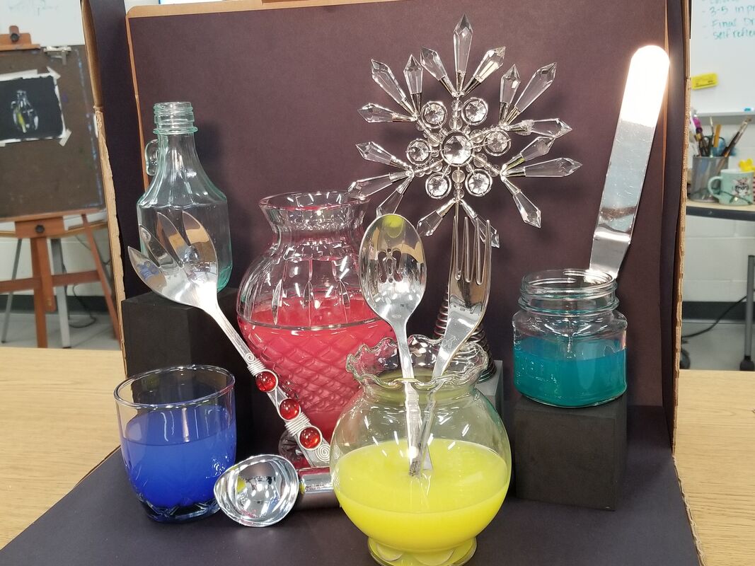
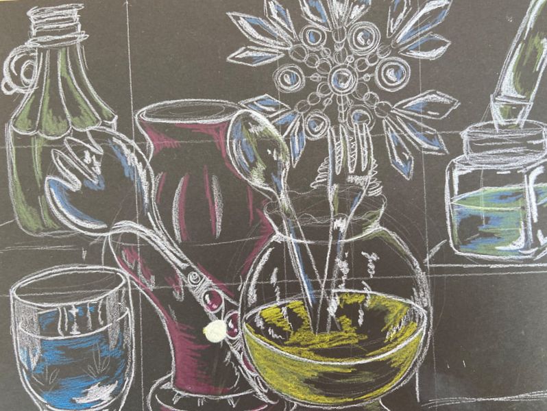
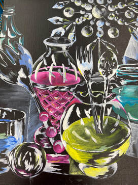
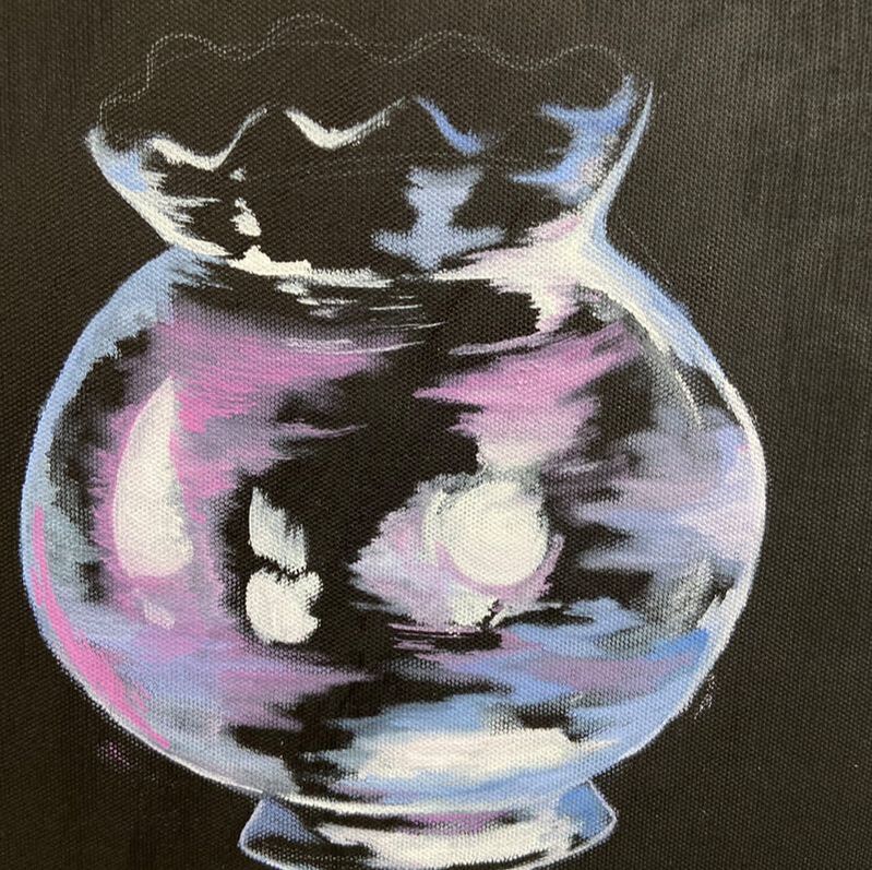
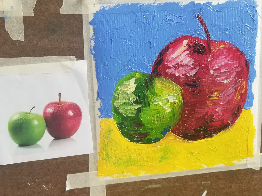
2. There were various forms in contrasts as far as sizing goes but because I made the pieces so close together to fit the canvas it was hard to show this. 3. The style within this painting was supposed to be reflective with a realistic feel to it though I feel that I made it too cartoon like. It was hard to find colors that made it eye catching yet kept a reflective look to it. 4. The only textures in this piece were smooth surfaces so there were no jagged edges or soft surfaces to convey. Though there were dips in some of the glass pieces and it was very vital to make the glass look reflective. 5. Looking back I notice specifically in the yellow bowl I forgot to make the other half of the pink colored vase. Along with that If I could change anything It would go beyond the painting and be the time. I feel as if, with more time This painting could have came out much better. Final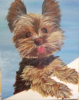 progress photos
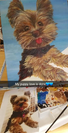
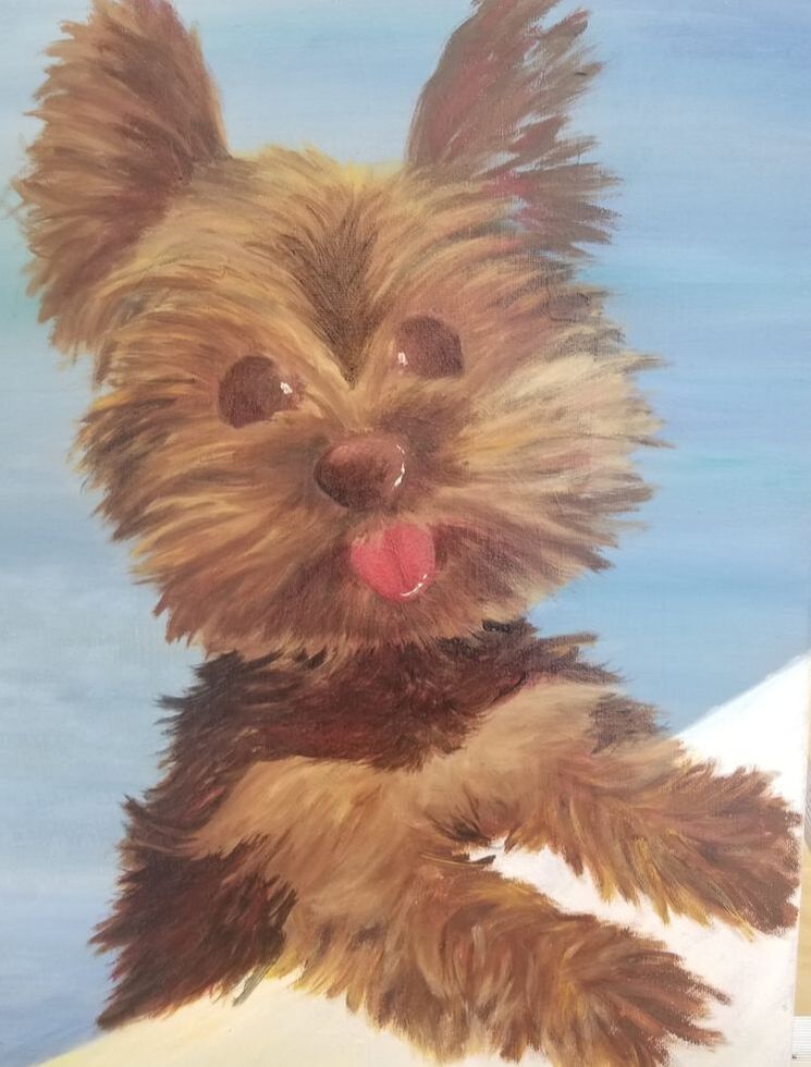
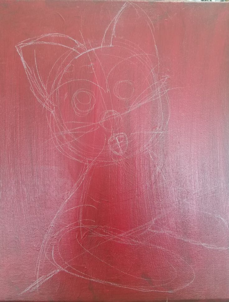
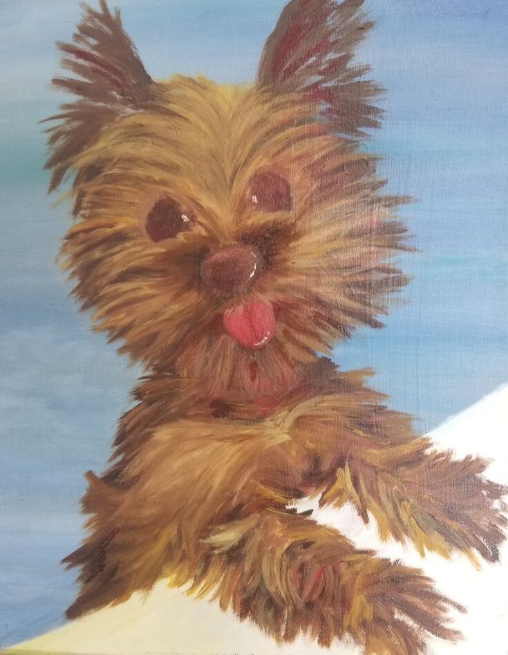
1. For this project I was given the task of taking an animal (preferably one with fur) and paint them. The goal was to use the media of oil pain to portray the texture of the fur ( or scales) and bring emotion in a face that isn't human. For this project I choose to do my puppy dog Cocoa though we call her poochie. It was important to not only portray a good copy of fur but to also mimic the direction in which the fur is growing. Making the animal have a soul is also important to show. This can be portrayed through the details in the eyes. more specifically the pupal.
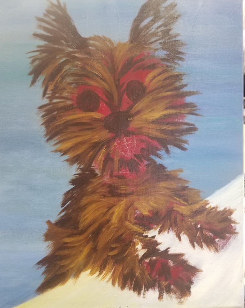
2. I felt that the most important technique that contributed to the paintings aesthetic was layering. As shown through the progress photos I made sure to start of with dark colors for the fur and work my way up to the lights as I add more detail. This was not only important n the fur but in the eyes as well, more specifically when adding the glossy finish or reflective highlights. 3. I made sure to use the layering technique the most. This was important when creating detail to give a more realistic feel. This was also the major difference between the last in progress photo and the finish product. 4. I felt that my overall growth was definity shown through this project. Mostly because of the amount of detail put into it. normally I would go for a more cartoonish look with a hint of realistic flare but I almost felt like this piece could and would come alive. I felt that I also improved as far as proportions and blending making sure that the puppy fit the canvas and each part of her body was proportionate to each other. 5. I absolutely love this painting not only for craftsmanship but model that I choose to paint for it as well. sketch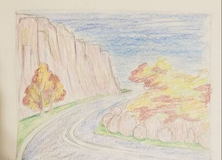
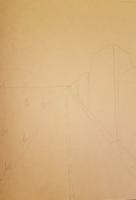
Finished Piece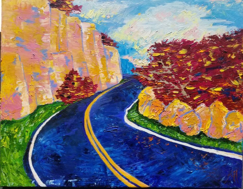 ce1. I'm not overly impressed by my craftsman ship though I a satisfied with its turn out. Instead of using a paintbrush I decided to go for a messy look by using the palette knife. I had a different method of painting when first going in though because i am not used to how well oil paint mixes I decided to use the palette knife.
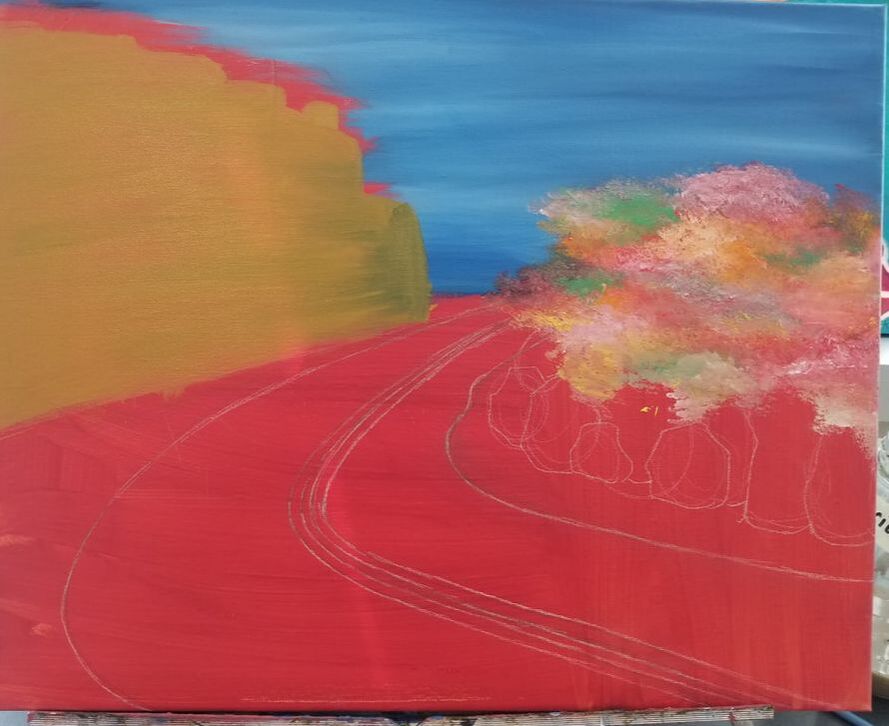
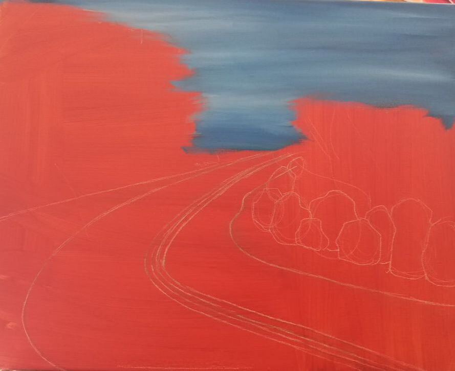
2. Throughout the painting I wanted to make sure to separate the warm and cold colors. The warm were used mostly for the rocks and leaves while the cold were for the sky and road.As I continued to paint I noticed that I wasn't sure what colors to use to use for leaves so they don't wash into the rocks and sky. Though I am satisfied with how I chose the purples and magentas for the leaves so they don't blend into the other aspects of the painting. 3. For the sections where I used warmer colors I made sure to highlight with a cooler color and the same with the warmer sections. This created contrast between warm and cold to bring out texture, color as well as to create depth. 4. using a palette knife was an easy way to create texture in my painting. One example being the leaves and the shrubs. The strokes I made going in different directs I feel worked well together to create a good texture that differs from the rocks, sky, or road. To highlight I used slightly more warmer tones in places dominated by cooler colors and cool colors in places dominated by warm places. 5. Because I used the palette knife it was hard to show a lot of detail thus hard to create depth. Though there were a few instances where I can call where I created depth and that would be when creating the highlights and shadows. The rocks and cliff in my painting and good examples of that. 6. My greatest painting technique that I used was my palette knife strokes. I created the messy look with the oil paint that I was going for. It also managed to stop form over mixing the colors past the point that I wanted them to. 7. My greatest difficulty with my drawing would be deciding on what colors to use where and how to highlight and shade certain spots. I feel if I didn't rough my drawing up like i did ten I would've had a more clear idea for what I wanted my painting to look like. 8. my greatest success with this painting would be my use for contrast. The sky, though simple, was also my favorite part because It had a messy yet clean look. You could tell what parts of the painting was and what my over all idea was without asking even though my design was messy.
Even though the palette knife was the most difficult to use I like the outcome of using that more than the paint brush. From this I learned just how much and how well oil paint can and does mix. It gives an easy way to make things look realistic and is an easy way to give texture. The only thing I don't really like about it is how smooth it is and depending on what I'm doing I don't really like how slow it dries.
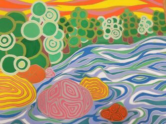
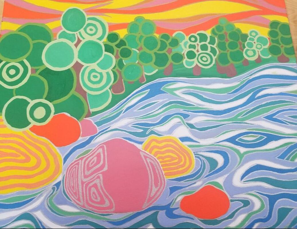
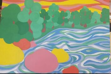
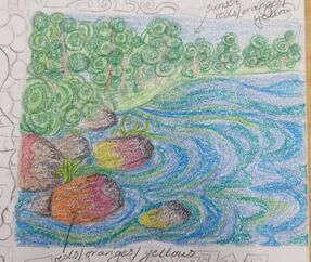
1. I feel satisfied with my craftsman ship. I made sure to make the lines thick like the referred art style as well as making sure there were no straight lines. I'm satisfied with the color scheme as well and am glad that in a way it all flows together.
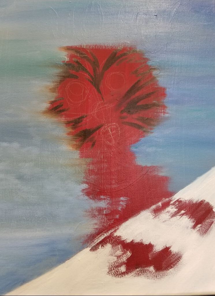
2. Like Hunderwasser I took a picture and turned it into a magical world, while still keeping the main elements and placings as the original photo. I made my lines thick and the over all picture full of color that doesn't draw your eye to one said place. 3.when choosing the colors I made sure to keep the water in the ranges of blues and purples. This was so people wouldn't mistake it for a field or another flat piece of land. Then to add some bright colors I added some yellows, reds and oranges to the sky to both imitate a sunset as well as add more eye catching color. 4. I felt that there were no direct focal point though If I could choose one now it would be the rocks. At first ( as seen in progress photo 1) I was going to leave them without detail to make it a focal point, though I felt that it stood out too much so I gave it curved squares. Even still it catches the eye a bit more than everything else. 5. I used texture withing the ripples of the water. I made sure I have an even mix of both thick and thin curvy lines to show the movement and flow of the water. 6. This was one of the ideas I choose that did not have a border. Though I feel that the painting is still brought together by the trees. 7. I had multiple difficulties making this work such as choosing which colors to use for what. Though my biggest struggle would be deciding what pattern to put into the rocks to make them not stand out to much but to not make them blend in at the same time. I also thought that making my lines neat was a huge challenge and looking at the finish product I see that I haven't fully solved that issue. Though to make it better I used the silver, bronze, and gold markers to make my lines look more neat and I am satisfied with the way that turned out in the end.
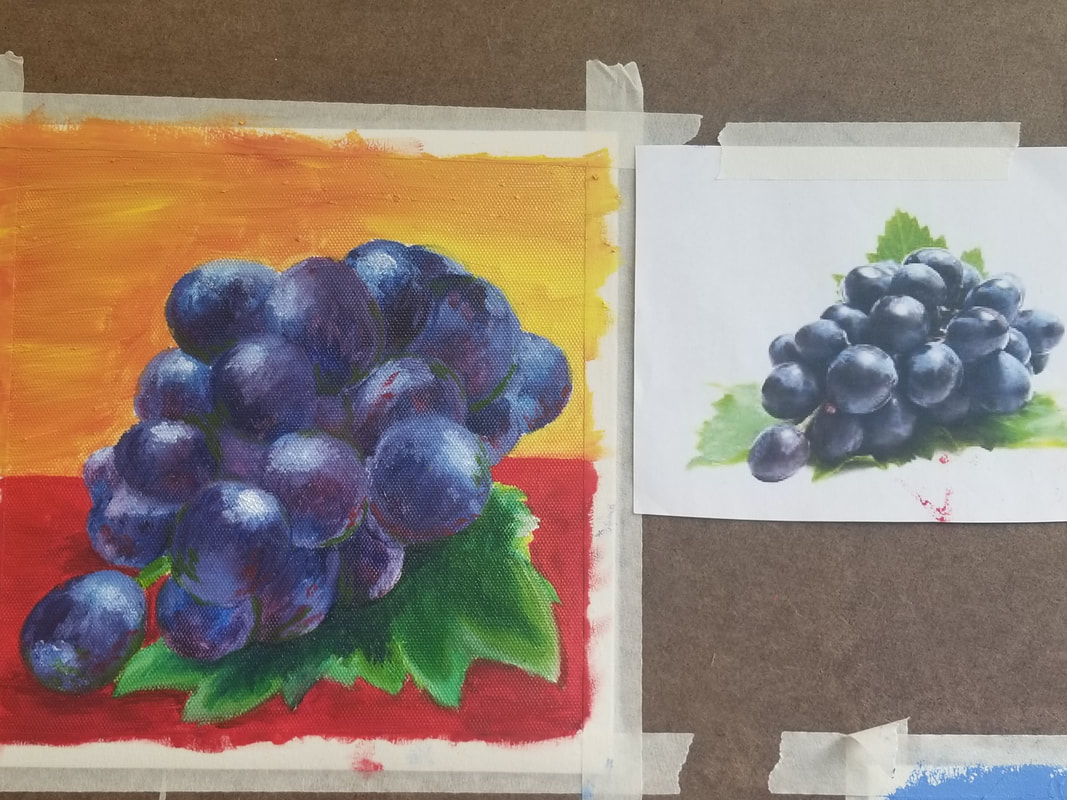
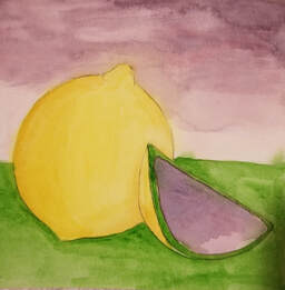
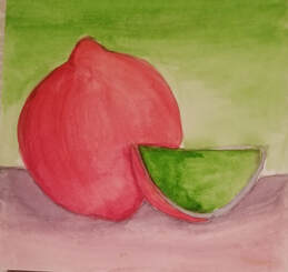
For this project I used split complimentary colors. My original idea was to do a lemon though I understand that It looks more like an orange or an onion. I was rushed for time to catch up with other projects but I tried my best. Overall I like how well the shading of colors match up though It is also noticeable how colors in some places have bleed into each other.
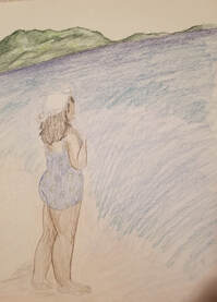
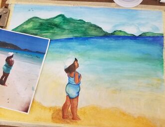
To the left is the piece in progress while to the right is the piece side by side to the reference photo. 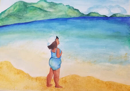 1. The most effective watercolor technique that I used had to be layering. This was helpful for me when making the water. I started with a light blue wash then layered a darker blue and green to give a slight gradiance.
2. It was important to use layers not only yo build up color but for mistakes as well. While making the waves connecting to the sand I had to be careful to start light the gradually add on blues and yellows. This is so you can make sure to preserve the whites of the paper that you need as well as to make it as dark or light as you need. 3. I made sure to pay close attention to the composition of the water. Making sure to add the right colors where they need to go. though it was stressful it was satisfying in the end. 4. color choice was very important in this painting because I was imitating an existing photo. It was important to match the color scheme and gradiance as much as possible. 5. Though there were parts that I loved there were parts that I had done differently. Mostly the mountains and the waves. I wish I had more white from the paper to work with though I had layered to much before I had the chance. Also, with the mountains I had worked the paper too much to make it darker like what it was meant to be. Thus I rate my craftsmanship a 6 out of 10. 6. If I could change anything It would be to add less water when making the sky and mountains to make them darker and more textured. Maybe add some salt. Also I would have been more detailed with the waves so they don't look so calm. 7. I learned that watercolor is something that you have to work with and not against. I am used to working with acrylic paint where I can layer as much as I want and change the colors as much as I would like. Though I realized that with watercolor to plan ahead and know exactly which color goes where before applying because once a color is applied it is hard to change it. I am looking forward to doing more watercolor work with my new found knowledge.
|
AuthorMy name is Phylicia and I go by the same thing. I'm pretty much an open book and my art work hopefully shows that as well. Archives
January 2020
Categories |
 RSS Feed
