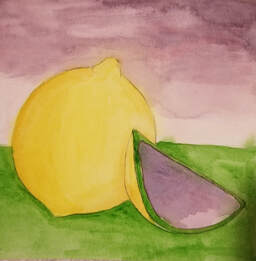
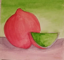
For this project I used split complimentary colors. My original idea was to do a lemon though I understand that It looks more like an orange or an onion. I was rushed for time to catch up with other projects but I tried my best. Overall I like how well the shading of colors match up though It is also noticeable how colors in some places have bleed into each other.
0 Comments
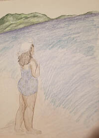
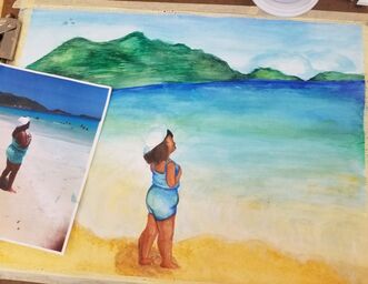
To the left is the piece in progress while to the right is the piece side by side to the reference photo. 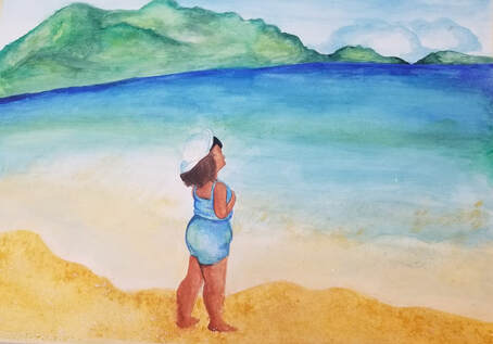 1. The most effective watercolor technique that I used had to be layering. This was helpful for me when making the water. I started with a light blue wash then layered a darker blue and green to give a slight gradiance.
2. It was important to use layers not only yo build up color but for mistakes as well. While making the waves connecting to the sand I had to be careful to start light the gradually add on blues and yellows. This is so you can make sure to preserve the whites of the paper that you need as well as to make it as dark or light as you need. 3. I made sure to pay close attention to the composition of the water. Making sure to add the right colors where they need to go. though it was stressful it was satisfying in the end. 4. color choice was very important in this painting because I was imitating an existing photo. It was important to match the color scheme and gradiance as much as possible. 5. Though there were parts that I loved there were parts that I had done differently. Mostly the mountains and the waves. I wish I had more white from the paper to work with though I had layered to much before I had the chance. Also, with the mountains I had worked the paper too much to make it darker like what it was meant to be. Thus I rate my craftsmanship a 6 out of 10. 6. If I could change anything It would be to add less water when making the sky and mountains to make them darker and more textured. Maybe add some salt. Also I would have been more detailed with the waves so they don't look so calm. 7. I learned that watercolor is something that you have to work with and not against. I am used to working with acrylic paint where I can layer as much as I want and change the colors as much as I would like. Though I realized that with watercolor to plan ahead and know exactly which color goes where before applying because once a color is applied it is hard to change it. I am looking forward to doing more watercolor work with my new found knowledge.
 With this project I took the 3 primary colors and made a gradiance for each of them ranging from a light wash to a dark layering. Then at the bottom I sketched 3, 3-D shapes (cone, sphere, and cylinder), and shaded each in according to the primary color gradiances.
In this project I used my Prisma colored pencils to recreate these apples. I am satisfied with the way they turned out though I will that I had added more detail. Most specifically with the water droplets. I'm impressed with how well the blue and green marinated together to make such a natural shading. Even though the light spots were also misplaced and sized I'm satisfied with the finished product.
|
AuthorMy name is Phylicia and I go by the same thing. I'm pretty much an open book and my art work hopefully shows that as well. Archives
January 2020
Categories |


 RSS Feed
